Third in a Series of Workshops with Artist David Chen
Green is a difficult colour to manage for many artists. It is a colour we see every day, but it can still become a problem when we are faced with using it in a painting. The familiarity in seeing it every day can be a part of the problem.
Some subjects can be a problem in certain tones, for example, dark green tones in seascapes. Added to that is what we perceive in photos that we may use as references. Colours can be flattened out in a photo and depth of the darker tones lost making interpretation more difficult. This makes the decision of which been to use harder as well. How to use photos needs to learnt just like many other skills in art. what do you use, what do you delete, what do you move, what colours do you alter, how do you transfer that image onto the canvas and create an artwork from it?
Painting from life, plein air, also has its challenges such as modifying colour, moving things to suit a composition and the added ones of chasing the ever moving shadows and light source. What it adds that photos do not, is the depth perception, as you are there with the original subject without the camera lens in between.
Middle tones are also a difficult subject for many artists, these mid tones (or greys or referring to monotones) are the links that bind other colours. Look at the work of the Impressionists and many tonal painters and you will see expert use of mid tones.
For the exercise of painting a dark and a light tone painting in green tones for this workshop, it was important to remember that the green is the dominant colour – not the only colour. There are also many types of green to call on. Blue greens, grey greens, brownish greens, yellow greens.
Creating a dominantly green toned painting means that if you knock back a colour you use a green, the undertone of green throughout the painting will hold it together and make all the colours relate to each other. it only takes the finest touch to create a beautiful colour that still holds the original colour but that relates to your green.
Understanding the use of dominant colours will help you to set up a palette for each painting that will help it to look right to the viewer. The palette can create moods, emotions and atmosphere that is beyond an unplanned use of colours that don’t work with each other.
Workshops such as these tonal exercises bring out weaknesses in painting methodology. We may have a colour bias or be stronger in dark toned paintings and not so well rounded for the lighter tones or mid tones which are more difficult again. Learning to paint with any combination of colours and tones will enable us as artists to paint anything we desire and broaden our range and comfort zone.
Personal Note
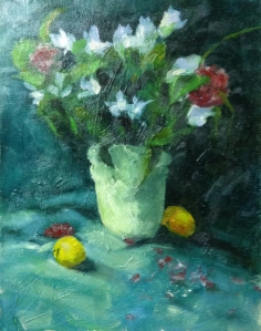
For this workshop, as with others in this series, I chose to paint the still life that David had set up for us. It is an opportunity to paint observationally from a real life setting and be creative with it, whilst attempting to follow the guidelines for the lesson.
I was asked to keep an eye on how much I define my foliage n the still life. In attempt to go looser, I overdid it. I am sure I can fix that in future sessions. I also needed just a couple more defined edges on the vase and a slightly darker shadow on the side of the vase. Not a lot. Overall David was very happy with my progress. I feel I leave each workshop having picked up more skills than I had on arrival, and more things to work on before the next workshop.
Below is the darker toned painting from this workshop, so you can see what we have been discussing.


Leave a comment